Showing posts with label Filter Effects Tutorial. Show all posts

Tuesday, 19 April 2011

Filter effects: Gaussian blur

This is part of my Filter effects tutorial series.

Gaussian blur makes objects appear softer and less clearly defined. Even by itself it is so useful that it was the first filter effect to be implemented in Inkscape. It also has received an own place in the Fill and Stroke editor:

When you use that slider, it creates a filter effect that contains a single Gaussian blur primitive and attaches that to selected object.

There are different kinds of blur. In Gaussian blur the colour from any pixel spreads out according to the Gaussian function (aka. bell curve). That means that the colour of any pixel stays mostly near itself, but some colour spreads out to a large area – in fact the colour spreads out to an infinitely large area, but in practise the contribution can't be seen quite far away. Another example of blur would be bokeh, the depth of field effect seen when some objects in a photo are out-of-focus. It is quite different from Gaussian blur: bokeh depends on the camera lens used, but usually spreads colour evenly to a circular area.

Gaussian blur is also useful as part of more complex filters. Many of the pre-defined filters in Inkscape distribution include blur. Here I'll show a couple examples. First up is drop shadow:

Here the Flood primitive is used to set the shadow colour, Gaussian blur to make the shadow softer and Offset to move the shadow.

Next up is filter that shows only object edges:

The Composite is in mode "out", meaning that we take parts of original image that are not in blurred image.

Last up is lighting filter, which requires a height map. Gaussian blur can be used to create an easy height map.


The SVG sources for the images are available from my filter tutorials repository at GitHub.

Sunday, 17 April 2011

Filter effects: Flood

This is part of my Filter effects tutorial series.

Flood may be the most simple filter primitive there is. It simply fills the whole filter area with one colour. By itself it's mostly useless, but it's often handy as part of more complex filters.

Here's a simple – almost stupid – example to show what Flood does by itself:

When you have a filter like this, the result will look like this:


Of course, this is probably the most inefficient way of using Inkscape to create a solid-coloured rectangle. So let's take a more interesting example. If you have ever tried to add a thick stroke to a text, you will have noticed that the result doesn't look too good. One way around this problem is to create a filter as follows:

Here I use the Morphology filter primitive in Dilate mode to create a thicker version of the text and Flood filter primitive to create the stroke colour. With Composite I do the operation "stroke colour in thick text", essentially colouring the thick text with my intended stroke colour. Finally, I take this thick, coloured text and composite the original text on top of it with Merge.

As you can see here, the version using stroke paint has certain problems, especially with the small holes in 'a', 'e' and 'f'. The filter produces a much nicer look, preserving the outline shape of the letters.

In a similar fashion you can use Flood in other filters to add in colours that don't exist in the original image.

The SVG sources for the images are available from my filter tutorials repository at GitHub.

Thursday, 14 April 2011

Filter effects: Displacement map

This is part of my Filter effects tutorial series.

Displacement map is used to warp images in different fashions. For example many of you may have seen a screen saver that warps a small, moving area of the desktop. That warping effect is done with a displacement map.

The displacement map filter primitive takes two input images: the image to be warped and a displacement map. The colour in displacement map defines, where the colour for this pixel should come from: you can pick one of the red, green, blue and alpha colour channels for vertical displacement and one for horizontal displacement. Light colours in selected channel make the filter take colours from below or right (or moves the image up or left). Likewise dark colours get the filter to pick colours from above and left. Mid-grey means zero displacement.


Here are some examples what filters can do. The top two cases show how solid colour displacement map simply moves the image (Offset filter is better for that, though). Interesting results come from using gradients (3rd example) or noise (4th example, using Turbulence filter)


These examples used filter set up as follows:

The Image filter primitive is used to grab the bunny as source image and then displacement map filters that using its own colours as the displacement map. This is for top two examples, the bottom two are similar but use scale of 28.8.

The meaning of displacement map setting is as follows:

  • First input image specifies the image to warp

  • Second input image specifies the displacement map

  • Scale specifies how large displacement should be

  • X and Y displacement specify the colour channels to use for horizontal and vertical displacement, respectively


There are some gotchas in building displacement map filters. It is best to use only completely opaque colours or only different levels of opacity to specify the displacements: on low opacities the colour information may be partially or even completely lost and this'll cause problems. The second thing is that the filter effects editor in Inkscape has occasional problems: on new displacement map primitive it may be needed to explicitly change X and Y displacement to non-default values (and back again, if you want the default)

The SVG sources for the images are available from my filter tutorials repository at GitHub.

Wednesday, 2 July 2008

Filter effects: Lighting effects

This is part of my filter effects tutorial series

Lighting effects can help in creating a feeling of depth in you image. They take in a height map and various light and material parameters and produce a light map. This light map can then be composited with your object to produce a result that looks like light falling on the object.

There are two lighting filters: Diffuse Lighting and Specular Lighting. This is how lighting is usually created in computer graphics. Diffuse is how the light reflects off a completely matte object, the sides facing light are brighter and sides facing away from light are darker. Specular in turn is how the light reflects off a smooth surface, it creates bright spots where the light reflects towards the viewer.

There are two other common lighting properteries: ambient lighting and mirror reflection. Ambient is the light that doesn't seem to come from any particular direction. In filter effects, ambient component comes from the original colour of the object. Mirror reflections, as the name states, are reflections that show the image of other objects. Mirror reflections are not supported by this simple lighting model.

First, before I'll explain these filters more throughly, I'll tell you a bit about height maps. SVG drawings are two-dimensional and as such, they don't actually contain any depth information. Without depth information, everything in the scene is completely flat, and lighting totally flat objects would be rather useless, because everything would be of same brightness. Height maps are used to overcome this problem. Any image can be used as height map, the transparent areas of image are the lowest point and the more opaque a point is, the more it is considered to be above image plane.
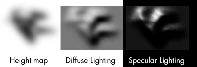

In this image, the height map here is completely black and lighter shades are more transparent areas. The light comes from top-left. You can see how this height map is used to create the looks of light falling on three-dimensional object.

For practical uses, it is often useful to create the height map automatically from the filtered object. Gaussian Blur, for example, is handy for this. The next image shows a height map derived from original object by Gaussian Blur
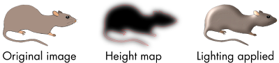
Again, the white areas in height map are transparent and more dark areas more opaque. The red line shows the original shape of the object, it's not actually part of the height map. The used lighting filter is from examples/lighting-filters.svg from Inkscape distribution. The result looks more like some rat-shaped badge than an actual rat, but I'd guess, it's quite fine for demonstration purposes.

So, enough of height maps, let's go to the actual effects. I'll start with Diffuse Lighting.

Diffuse Lighting is, as I stated above, the light reflecting off a completely matte object. In reality, it's hard to find any such object, but cotton cloth, unpolished stones, bricks and other such materials with highly uneven surfaces come close.
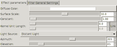

There's a bunch of settings for Diffuse Lighting, so let's go through them.

Diffuse Color sets the light colour to be used.
Surface Scale determines, how to map the height map to actual height values. The bigger the value, the higher the peaks of height map. Also, you can move this to negative side, to turn the peaks into valleys.
Constant modifies the strength of the light. High constants result in harsh lighting and strong contrasts between the light and dark areas.
Kernel Unit Length is not yet used in Inkscape. It is used to make the result resolution-independent. Now that it isn't used, with high zooms you can see odd plateaus forming. (There's an other way around this, though it requires using XML editor. See examples/lighting-filters.svg in Inkscape distribution)
Light Source determines the type of light used. Available settings below that also depend on type of light used.

The resulting image from Diffuse Lighting is fully opaque. It is best used by multiplying the colour values with the colour values of original image. This can be accomplished with Composite filter in Arithmetic mode and multipliers set as K1=1.0, K2=0.0, K3=0.0, K4=0.0. (See Composite tutorial for more through explanation of these factors)

Specular Lighting simulates light reflecting off a smooth surface. Plastic and metallic objects often have strong specular reflections, though for really smooth objects mirror reflection can become dominating.
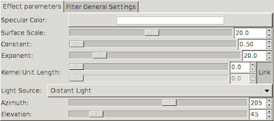

Most settings for Specular Lighting are same as for Diffuse, so I'll just go through the new ones.

Specular Color is the same as Diffuse Color, it determines the light colour.
Exponent is completely new here: it determines the shininess or smoothness of the object. Low values correspond to not-really-shiny objects, high values to really smooth objects. Essentially, the higher the exponent value is, the smaller and sharper the shiny spots are.

Specular Lighting filter produces an image, that is filled with Specular Color, but opaque only where the specular highlights should fall. It is best used by adding the colour values with the colour values in the original image, or the colour values of diffuse shaded image, if you're using both lighting modes. This can be done with Composite filter in Arithmetic mode and multipliers set to K1=0.0, K2=1.0, K3=1.0, K4=0.0.

Although the filters I've shown here have used Gaussian Blur to create the height map, this is by no means a requirement. Any image will do, though preferably one with several shades of opacity. For example, using result of Turbulence filter as height map can create interesting effects. Here, I've used turbulence to create an effect that looks somewhat like crumbled tin foil.
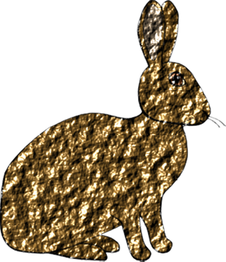
The filter is available in Inkscape distribution in file examples/turbulence_filters.svg

Thursday, 29 May 2008

Filter effects: Convolve Matrix

This is part of my filter effects tutorial series

Convolve Matrix can be used for several different effects like blurring, sharpening, edge detection and embossing. While it's a powerful tool, it can take quite some expertise to create the desired effect.

Inkscape support for Convolve Matrix filter primitive is not yet quite finished, but it can already be used for some work. The biggest problem is, the results will depend on the rendering resolution.

The idea of this filter is to apply a convolution on image. Basically, it takes certain amount of pixels around the target pixel, multiplies the colour values of each pixel by its multiplier and sums them up to form new colour value for the target pixel. There also exists common divisor and bias that will be applied after summing pixel values up.

For more through and mathematical explanations of convolutions, see Wikipedia page on Convolutions or article on Matrix convolution filters on GameDev.net.

Here's an graphical example with single target pixel and the 3×3 area surrounding it.


This same filter is specified in Inkscape Filter Effects dialog as follows:


Two special notes here: first of all, the bias is specified as 128 in the first image but as 0.5 in second image. These are actually the same thing, the first image just uses colour values in range 0–255, the second image in range 0–1.

Second, the divisor isn't actually required. I could have specified the kernel with values of -1/8 and 1.0 and left the divisor as one. The divisor just makes specifying the values easier.

Here are some examples of possible effects:

Box blur:

(notice though: usually it's better to use the Gaussian Blur filter primitive for blurring)

Motion blur:


Edge detection:


Sharpen:


Embossing:

Friday, 2 May 2008

Filter effects: Composite

This is part of my filter effects tutorial series.

Composite is, as the name states, an effect that can composite images together. It uses the Porter-Duff blending modes named after the writers of the paper, where it was published. For those of you with ACM Digital Library access, here's a link to the original paper: Compositing Digital Images: Porter, Duff.

The Porter-Duff blending modes are basically logical operations applied to images. For example, you can go and take an exclusive or of two images. In the original paper there was a table showing an example of each mode and some variation of that has been included in most places, where these modes are explained. Now that I have my two test subjects, Max the rat and Gina the rabbit, I can use them instead of boring triangles.


From this image, one can notice several useful relations between the different modes: over is actually the ordinary alpha compositing, out and atop are complete opposites of each other, as are in and xor.

There is a gotcha for making this kind of images: whenever you use the Background Image you need to enable it and to remember that the filter output doesn't replace the background but instead is composited over it. So, if you just created composite filter with xor mode, you'd notice that it just seems to change the compositing order. The gotcha is that the area where the both objects are atop each other is transparent and shows through the original background. So, to make these images, I actually created a solid background inside the filter to hide the original background.

There is also a sixth mode called Arithmetic. It allows you to specify the result as linear combination of input image colours. Put other way, you can specify four constants K1-K4 for the equation (result colour) = K1 * (input 1 colour) * (input 2 colour) + K2 * (input 1 colour) + K3 * (input 2 colour) + K4. With these, you can take sum of two colours (K1 = 0, K2 = 1, K3 = 1, K4 = 0), product of two colours (K1 = 1, K2 = 0, K3 = 0, K4 = 0) and plethora of other combinations. Here are a couple examples

Monday, 28 April 2008

Animal test subjects

I noticed some time ago that using five pointed stars as example material is growing a bit old. I needed something new to test these filters with. So, I came up with the idea of using animal test subjects. Here are the two: Max and Gina.

While animal testing can be cruel and inhumane, I promise to treat my two test subjects kindly. You'll be seeing them in new Filter Effects tutorials shortly.

Sunday, 20 April 2008

Filter effects: Color Matrix

This is part of my filter effects tutorial series.

Color Matrix is an interesting filter, that can mix up the colours in your image in many ways. Blanc and white images, sepia toning, hue rotation and removing one of the basic colours from image are a couple examples, what kind of modifications this filter can do.

The mathematical idea behind Color Matrix is, that it multiplies the colour of each pixel by a 5×5 matrix. SVG won't let you to specify the whole matrix, but only the first four rows. The last row is always "0 0 0 0 1", which means that the imagined fifth colour value will always be one. (red, green, blue and alpha are the four actual colour values)

Nevertheless, you don't need to know much about the mathematics to be able to use this filter. Let's take an example image from Inkscape Filter Effects user interface:
Here I've specified an sepia tone filter. Not too good one, but it'll make for an good example about how these work.

So, what are all these numbers?
The basic concept here, is that each column represents an input colour: red, green, blue, alpha and constant addition. Each row in turn represents an output colour: red, green, blue and alpha. For example, the first row means "Take 0.14 times the red value of a pixel, 0.45 times the green value a pixel, 0.05 times the blue value of a pixel and zero times the alpha value of a pixel, sum these and add zero. The result is the red value of output pixel"This same process is applied to all primary colours of a pixel for every pixel in the filtered area.

The fourth row of this example filter is also noteworthy. Not only it defines the modification applied on the alpha channel, it also is an identity modification. Here on the alpha row, alpha is multiplied by one and all other inputs by zero, thus preserving the original alpha channel. With the same idea, you could for example swap the contents of green and blue channels:

Besides the matrix mode, the Color Matrix filter provides also three convenience modes, so you won't have to create the whole matrix every time:
Saturate: this is a bit funny name, as this Saturate actually desaturates the image. You are provided with a slider allowing you to choose from full scale between full saturation and zero saturation (black and white).
Hue Rotate: this does just what it says, it rotates the hues of your image. If you rotated the colour wheel in Fill and Stroke dialog same amount for every colour in filtered object, the effect would be just about the same.
Luminance to Alpha: this can be handy as part of bigger filter, it turns the luminance of input image as opacity of output image. White areas become totally opaque, black areas totally transparent and everything other becomes something in between.

I've found Color Matrix especially handy for adjusting the output from Turbulence filter, as Color Matrix can change the colour of an image, make areas with low alpha values completely transparent etc. The following examples are from turbulence_effects.svg included in Inkscape distribution and they use both Color Matrix and Turbulence:

Filter effects: Blend

This is part one of my filter effects tutorials, where I'll describe the filter effects existing in Inkscape and general information about using and creating filter effects.

The blend filter composites two images pixel by pixel. It provides four compositing modes common in raster graphics editors: multiply, screen, darken and lighten. Also, it can be used to do the normal alpha compositing used in SVG.

Blend is also other one of the filters, that can be used without going to filter effects dialog in Inkscape: it is used to provide the layer blending modes.

The different blending modes work as follows:
Multiply: works like mixing pigments. Magenta and yellow make red, red and cyan make black etc.
Screen: works like mixing lights. Red and blue make magenta, magenta and green make white etc.
Darken: works like normal compositing, but composites both first image on top of second and second image on top of first and takes the darker result for each pixel and each colour channel, efficiently making the resulting image darker than either of source images.
Lighten: like darken, but takes the lighter results.

For multiply and screen, the following image might explain this better than I can:
On left: red, green and blue (RGB) circles composited with Screen.
On right: cyan, magenta and yellow circles (CMY) composited with Multiply.

For more complex effects, blend can be a handy tool when collecting several parts of the filter effects chain together.

There are a couple gotchas with blend filter in Inkscape and in general:
First, while Inkscape provides you with layer blending modes, such a concept doesn't actually exist in SVG 1.1. When you specify a layer blending mode, Inkscape creates a blend filter, that takes everything with lower z-index as your layer and composites that with your layer contents. This is the filter result. The filter result is then composited on the canvas, on top of everything with lower z-index. If your drawing has a solid background, this is just fine. If the background is not solid, it will be drawn twice. You may end up with funny looking results like in the following image:
On the top, over solid white background, everything works just fine. But on the bottom over transparent background, you can see a box appearing around the small star.

The other gotcha is the enable-background property. If you want to use background image as part of any filter, that property must be set. Some parent node of the object, you are applying the filter to, has to have this so that SVG renderers know, what part of background you want to use for compositing. This only applies to hand-made filter effects, if you use the layer blending mode combo box, Inkscape will take care of setting this property for you. For now, the easiest way to set enable-background so that you can use background in your filters, is to set some blending mode from layers palette.