I have read quite a bit of web comics lately. A couple nice ones are Lackadaisy and Bittersweet Candy Bowl. Lackadaisy is a superbly drawn comic about a speakeasy called Lackadaisy and the folks running that place in 1920's during the prohibition. Bittersweet Candy Bowl in turn is a comic about high school teenagers who have in between them a bunch of one-way – and sometimes two-way – love relationships, and drama ensues.
These two don't have much in common, except that in both the main characters are cats. The Lackadaisy world is run by cats only, whereas BCB world is run by both cats and dogs and has bunch of other talking animals as well.
Nevertheless, the idea I had was: what if the folks from these two worlds came across each other? Never mind that they are from quite different eras or that the other cats walk around mostly naked and the others tend to be fully and stylishly dressed.
This would happen. Sooner or later.
The boy cat in comfy blue scarf is Mike from Bittersweet Candy Bowl. The lady cat in lovely orange dress is the ever chipper Ivy Pepper from Lackadaisy. The tools used are, as usual, ProMarker colored markers and Fine Liner black pens on marker-proof paper, all from Letraset.
Writings and tutorials on Filter Effects in Inkscape — and sometimes other stuff in field of graphics and open source.
Showing posts with label drawing. Show all posts
Saturday, 26 January 2013
Sunday, 16 September 2012
Neon Markers
The folks at Letraset were kind enough to send me a sample pack of their new Neon Markers. I tried them out and I feel they are quality items, though maybe limited to some special purposes.
Basically, the Neon Markers are artistic markers with fluorescent inks. The construction will be very familiar to anyone who has used ProMarkers from Letraset. Only discernible difference is that ProMarkers have small bullet tip on one end and larger chisel tip on the other, whereas Neon Markers have a bullet tip on both ends, one small and other larger.
The idea of fluorescent colours is that the colour appears impossibly bright, as if it was reflecting more light than there is. In fact, the colour is taking in light of a high frequency, such as ultraviolet light, and emitting it on lower frequency, such as yellow light.
The fact that Neon Marker colours react to ultraviolet light makes them especially attractive to situations where there's plenty of such light present. These colours will literally shine in places illuminated with little ordinary light and several blacklight bulbs.
Many of you may have already noticed that this fluorescent property is nothing new: in fact the common highlighter pens contain similar ink. I tried some highlighter pens I have and compared them to these Neon Markers. The colours hues are really similar to each other, but the colours of Neon Markers are clearly more saturated and vibrant than the colours of highlighters.
Here are the Neon Marker colours with some similar colours from the ProMarker range.
The Neon Marker colours in this picture are not too distinctive
from what you can achieve with normal marker colours, except for luminous yellow and maybe for radiant orange.
In the real life the differences were more visible, but the limited
capabilities of the camera and computer monitors dull out the colours.
So, if your target is to make something that will be shown on computer
screen, the Neon Markers are so-so. Photocopying or ordinary four-colour
printing will likely bump into same issue.
Here are the same colours when illuminated with a small ultraviolet torch.
In ultraviolet light the Neon Markers really come to life, except for volt blue. That one just seems to have very little fluorescent properties and is almost the same colour as sky blue from ProMarker range. My camera seems to have somewhat freaked out with the colours in the picture illuminated with ultraviolet light, but you can still see the main point: the Neon Marker colours shine while other colours seem to become dull and dark in comparison to them.
So, to recap: these markers are so-so when the result is reproduced on computer screen. They are a lot better when people can see the original drawing you made. And when the original drawing is displayed under ultraviolet light aka. blacklight, that's when these markers work the best.
Basically, the Neon Markers are artistic markers with fluorescent inks. The construction will be very familiar to anyone who has used ProMarkers from Letraset. Only discernible difference is that ProMarkers have small bullet tip on one end and larger chisel tip on the other, whereas Neon Markers have a bullet tip on both ends, one small and other larger.
The idea of fluorescent colours is that the colour appears impossibly bright, as if it was reflecting more light than there is. In fact, the colour is taking in light of a high frequency, such as ultraviolet light, and emitting it on lower frequency, such as yellow light.
The fact that Neon Marker colours react to ultraviolet light makes them especially attractive to situations where there's plenty of such light present. These colours will literally shine in places illuminated with little ordinary light and several blacklight bulbs.
Many of you may have already noticed that this fluorescent property is nothing new: in fact the common highlighter pens contain similar ink. I tried some highlighter pens I have and compared them to these Neon Markers. The colours hues are really similar to each other, but the colours of Neon Markers are clearly more saturated and vibrant than the colours of highlighters.
Here are the Neon Marker colours with some similar colours from the ProMarker range.
Here are the same colours when illuminated with a small ultraviolet torch.
In ultraviolet light the Neon Markers really come to life, except for volt blue. That one just seems to have very little fluorescent properties and is almost the same colour as sky blue from ProMarker range. My camera seems to have somewhat freaked out with the colours in the picture illuminated with ultraviolet light, but you can still see the main point: the Neon Marker colours shine while other colours seem to become dull and dark in comparison to them.
So, to recap: these markers are so-so when the result is reproduced on computer screen. They are a lot better when people can see the original drawing you made. And when the original drawing is displayed under ultraviolet light aka. blacklight, that's when these markers work the best.
Saturday, 6 August 2011
Drawing for Assembly 2011
I created this image on Inkscape for the Fast Graphics competition at Assembly 2011. The theme for this year was Last minute and there was one and half hours time to make the image, from when the theme was published to submission deadline. Sadly, this didn't make it past jury and thus wasn't show on big screen.
Not the best of my drawings, I admit. In 2009 I did manage to get my drawing on big screen. That time the theme was "Over the edge" or something like that and time limit again 1½ hours. Here's the result, drawn in Inkscape.
The SVG source files are available at my GitHub reposistory.
Not the best of my drawings, I admit. In 2009 I did manage to get my drawing on big screen. That time the theme was "Over the edge" or something like that and time limit again 1½ hours. Here's the result, drawn in Inkscape.
The SVG source files are available at my GitHub reposistory.
Thursday, 28 April 2011
Making buttons with Inkscape
During my university studies I've made several buttons for TKO-äly, the organization for computer science students at Helsinki University. Here I'll describe my method for creating these buttons. The usual process is that I first sketch the button on paper, then draw the main image on paper or with Inkscape. Finally I composite the image with background and place several complete images on a single A4 sheet for printing, both using Inkscape. The printed images are then cut out from the paper sheet and made into buttons using a hand-operated button tool.
This post will be rather image-heavy, so it'll continue after the jump.
Monday, 28 July 2008
Never Trust a Smiling Succubus?
So, she approaches you, with bright smile and cute-but-curvy looks. Talks sweet nothings to your ear. Why should there be anything to worry about? Horns? What horns?

Markers and black pen on paper. Inspiration from one of the greatest webcomics out there, Sinfest. That comic's been running for eight years straight and still going strong.

Markers and black pen on paper. Inspiration from one of the greatest webcomics out there, Sinfest. That comic's been running for eight years straight and still going strong.
Friday, 30 May 2008
Fun with markers 2: Freefall
A couple days ago I bumped into a great webcomic Freefall. One thing that caught my interest was how well the artist is able to express the characters' moods, reactions etc. in small scale and with just a couple lines. I decided to try and imitate that style.
So, here's Florence Ambrose, a Bowmans Wolf and a technician, from Freefall:

While I'm not quite happy with the colours (I need more brown shades!) I think that came out quite well.
For those who've been following this webcomic, finding the strip with Florence posing like that shouldn't be a hitch.
Also, I noticed that there are some interesting colours in my palette:

Blender, Orange and Apricot. Too bad, there's no colour Peach in my palette nor in ProMarker colour range.
So, here's Florence Ambrose, a Bowmans Wolf and a technician, from Freefall:

While I'm not quite happy with the colours (I need more brown shades!) I think that came out quite well.
For those who've been following this webcomic, finding the strip with Florence posing like that shouldn't be a hitch.
Also, I noticed that there are some interesting colours in my palette:

Blender, Orange and Apricot. Too bad, there's no colour Peach in my palette nor in ProMarker colour range.
Monday, 28 April 2008
Animal test subjects
I noticed some time ago that using five pointed stars as example material is growing a bit old. I needed something new to test these filters with. So, I came up with the idea of using animal test subjects. Here are the two: Max and Gina.

While animal testing can be cruel and inhumane, I promise to treat my two test subjects kindly. You'll be seeing them in new Filter Effects tutorials shortly.

While animal testing can be cruel and inhumane, I promise to treat my two test subjects kindly. You'll be seeing them in new Filter Effects tutorials shortly.
Thursday, 24 April 2008
Fun with markers
Almost two weeks ago I was looking to buy more colour pencils, as my old set of 12 pencils didn't include any skin tones. Well, I found me a nice 24 piece set, which still doesn't contain many skin tones and actually I already had half of those colours. I would probably been better off finding a retailer with loose pencils and buying a couple skin tones.
Well nevertheless, colour pencils weren't what I was going to blog about. Markers are. At the same trip, I noticed some sets of markers next to the colour pencils. There were sets in different styles: bright colours, grays, skin tones... Wait, that's what I wanted, wasn't it? Well, I ended up buying a comic art set with one skin tone, brown, blue, red and black so I could test them out.
I tested those five markers out and I totally liked them. They're rather fast to work with and they produce strong and brilliant colours. But, five colours is rather limiting. So, after weekend I went and bought some more and now I'm a happy owner of some twenty Letraset ProMarkers. Nothing too much, but as even those cost a bit much for my budget, they'll have to do for now.
But, let's cut the long story short, here's a picture I drew with those markers:
Well, ok. I did use a bit more than markers: black ink pen for the lines and colour pencil to smooth out the background somewhat.
One thing I can't seem to figure out, is how to draw areas of flat colour. Look at the floor in previous image, for example. While using special paper meant for marker drawing alleviates this problem somewhat, it's still really easy to get visible stripes.
Well nevertheless, colour pencils weren't what I was going to blog about. Markers are. At the same trip, I noticed some sets of markers next to the colour pencils. There were sets in different styles: bright colours, grays, skin tones... Wait, that's what I wanted, wasn't it? Well, I ended up buying a comic art set with one skin tone, brown, blue, red and black so I could test them out.
I tested those five markers out and I totally liked them. They're rather fast to work with and they produce strong and brilliant colours. But, five colours is rather limiting. So, after weekend I went and bought some more and now I'm a happy owner of some twenty Letraset ProMarkers. Nothing too much, but as even those cost a bit much for my budget, they'll have to do for now.
But, let's cut the long story short, here's a picture I drew with those markers:
Well, ok. I did use a bit more than markers: black ink pen for the lines and colour pencil to smooth out the background somewhat.One thing I can't seem to figure out, is how to draw areas of flat colour. Look at the floor in previous image, for example. While using special paper meant for marker drawing alleviates this problem somewhat, it's still really easy to get visible stripes.
Saturday, 12 January 2008
Maybe I could claim this as modern art
Tuesday, 13 November 2007
It's a Sign!
A couple days ago, I was browsing the Stick Figures in Peril group on flickr. It's a great group, totally worth a look. There I spotted this lovely British "Elderly People" warning sign. There was much speculation, what the lady on the sign was doing, maybe she was picking the mans pockets? For me it was obvious: they were dancing Letkajenkka, they just were a bit lonely.
So, I got them a couple friends and here they go:
(Click on the image to see the animated version)
Original picture from theCallowQueen from flickr. Licensed under Creative Commons Attribution-Noncommercial-Sharealike 2.0 license.
I traced the figures and created a couple new poses in Inkscape, after which I composited the image using GIMP.
So, I got them a couple friends and here they go:
(Click on the image to see the animated version)Original picture from theCallowQueen from flickr. Licensed under Creative Commons Attribution-Noncommercial-Sharealike 2.0 license.
I traced the figures and created a couple new poses in Inkscape, after which I composited the image using GIMP.
Thursday, 31 May 2007
Making use of Inkscape
I'm spending plenty of time developing a drawing program, so I decided to draw something for change.
This drawing is based on a photograph, but only to get the anatomy correct. I started with ordinary A4 copier parer and pencil for the first sketches. For the outline drawing I used heavier A4 drawing paper, on which I first drew the subject with pencil and then inked with a brush pen and 0.20 mm pen.
Scanning was a bit of a problem, as my scanner seems to be breaking down. The scanned image was full of horizontal colored lines. Luckily all those lines were bright colours, so I was able to open the image up in GIMP, take a CMYK separation of the image and discard all but the K (black) channel.
From this on, I used Inkscape for the work. Tracing the inked line drawing gave me a nice vector representation. This was actually surprisingly simple, as in GIMP - which I have used for drawing, too - separating these lines from background would have taken many steps and still wouldn't have yielded as well-defined lines.
The new paint bucket tool is a godsend for colouring drawings. Filling areas of drawing with the basic colour is only a mouse click away. With default settings, the filled area is not quite correct, as white lines show up between the area and bounding line, but this is easily remedied by increasing the value of "Grow / shrink by".
For adding shadows, I got to use the new featured I had created myself (Yay!). For this drawing I had though, that the lighting is quite warm, like summer day light, so I picked a cold color for the shadows - dark blue to be exact. Simple alpha blending with this kind of colour leaves a bit to be desired, so I used feBlend with multiply mode. Each shadow shape has an opacity of 20% instead of the whole shadow layer having that opacity - this way stacking shadows on top of each other will create darker shadows.
The few brighter spots are also created by using feBlend, this time with screen as mode. I feel that bright spots are really easy to overdo, so they are quite subtle here - some maybe even too subtle.
Well, for the bubbles and background I used plenty of gradients - probably not hard to tell ;) The bubbles are all clones, so it was easy to edit their appearance, when they didn't seem quite correct.
The pier planks are all unique, the tops are created by duplicating one plank, though. Also, lots of guidelines were used here. This is a place, where I wished that the 3D tool wasn't still in planning, but an usable tool.
And yes, the result:
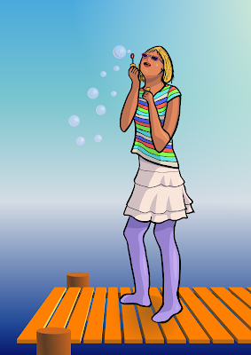
I was also thinking, that I might create some kind of tutorial about this, too. I did take screenshots and save several copies of the image along the way. This might be a bit too large subject for a tutorial, though.
And yes, I haven't totally forgotten coding. As pointed out in inkscape-devel mailing list my last changes to codebase broke the about screen... Mixing these C and C++ objects is tricky sometimes. This time problem was that a C++ object inside a C object wasn't getting initialized. If both objects were of C++ style, this initialization would have happened automatically.
This drawing is based on a photograph, but only to get the anatomy correct. I started with ordinary A4 copier parer and pencil for the first sketches. For the outline drawing I used heavier A4 drawing paper, on which I first drew the subject with pencil and then inked with a brush pen and 0.20 mm pen.
Scanning was a bit of a problem, as my scanner seems to be breaking down. The scanned image was full of horizontal colored lines. Luckily all those lines were bright colours, so I was able to open the image up in GIMP, take a CMYK separation of the image and discard all but the K (black) channel.
From this on, I used Inkscape for the work. Tracing the inked line drawing gave me a nice vector representation. This was actually surprisingly simple, as in GIMP - which I have used for drawing, too - separating these lines from background would have taken many steps and still wouldn't have yielded as well-defined lines.
The new paint bucket tool is a godsend for colouring drawings. Filling areas of drawing with the basic colour is only a mouse click away. With default settings, the filled area is not quite correct, as white lines show up between the area and bounding line, but this is easily remedied by increasing the value of "Grow / shrink by".
For adding shadows, I got to use the new featured I had created myself (Yay!). For this drawing I had though, that the lighting is quite warm, like summer day light, so I picked a cold color for the shadows - dark blue to be exact. Simple alpha blending with this kind of colour leaves a bit to be desired, so I used feBlend with multiply mode. Each shadow shape has an opacity of 20% instead of the whole shadow layer having that opacity - this way stacking shadows on top of each other will create darker shadows.
The few brighter spots are also created by using feBlend, this time with screen as mode. I feel that bright spots are really easy to overdo, so they are quite subtle here - some maybe even too subtle.
Well, for the bubbles and background I used plenty of gradients - probably not hard to tell ;) The bubbles are all clones, so it was easy to edit their appearance, when they didn't seem quite correct.
The pier planks are all unique, the tops are created by duplicating one plank, though. Also, lots of guidelines were used here. This is a place, where I wished that the 3D tool wasn't still in planning, but an usable tool.
And yes, the result:

I was also thinking, that I might create some kind of tutorial about this, too. I did take screenshots and save several copies of the image along the way. This might be a bit too large subject for a tutorial, though.
And yes, I haven't totally forgotten coding. As pointed out in inkscape-devel mailing list my last changes to codebase broke the about screen... Mixing these C and C++ objects is tricky sometimes. This time problem was that a C++ object inside a C object wasn't getting initialized. If both objects were of C++ style, this initialization would have happened automatically.
Subscribe to:
Posts (Atom)


