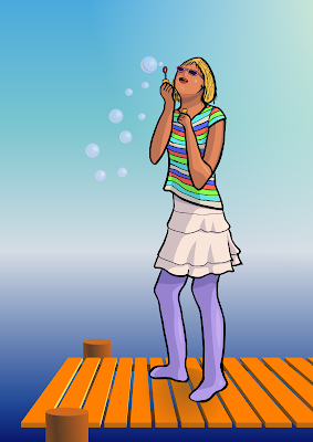
This drawing is based on a photograph, but only to get the anatomy correct. I started with ordinary A4 copier parer and pencil for the first sketches. For the outline drawing I used heavier A4 drawing paper, on which I first drew the subject with pencil and then inked with a brush pen and 0.20 mm pen.
Scanning was a bit of a problem, as my scanner seems to be breaking down. The scanned image was full of horizontal colored lines. Luckily all those lines were bright colours, so I was able to open the image up in GIMP, take a CMYK separation of the image and discard all but the K (black) channel.
From this on, I used Inkscape for the work. Tracing the inked line drawing gave me a nice vector representation. This was actually surprisingly simple, as in GIMP - which I have used for drawing, too - separating these lines from background would have taken many steps and still wouldn't have yielded as well-defined lines.
The new paint bucket tool is a godsend for colouring drawings. Filling areas of drawing with the basic colour is only a mouse click away. With default settings, the filled area is not quite correct, as white lines show up between the area and bounding line, but this is easily remedied by increasing the value of "Grow / shrink by".
For adding shadows, I got to use the new featured I had created myself (Yay!). For this drawing I had though, that the lighting is quite warm, like summer day light, so I picked a cold color for the shadows - dark blue to be exact. Simple alpha blending with this kind of colour leaves a bit to be desired, so I used feBlend with multiply mode. Each shadow shape has an opacity of 20% instead of the whole shadow layer having that opacity - this way stacking shadows on top of each other will create darker shadows.
The few brighter spots are also created by using feBlend, this time with screen as mode. I feel that bright spots are really easy to overdo, so they are quite subtle here - some maybe even too subtle.
Well, for the bubbles and background I used plenty of gradients - probably not hard to tell ;) The bubbles are all clones, so it was easy to edit their appearance, when they didn't seem quite correct.
The pier planks are all unique, the tops are created by duplicating one plank, though. Also, lots of guidelines were used here. This is a place, where I wished that the 3D tool wasn't still in planning, but an usable tool.
And yes, the result:

I was also thinking, that I might create some kind of tutorial about this, too. I did take screenshots and save several copies of the image along the way. This might be a bit too large subject for a tutorial, though.
And yes, I haven't totally forgotten coding. As pointed out in inkscape-devel mailing list my last changes to codebase broke the about screen... Mixing these C and C++ objects is tricky sometimes. This time problem was that a C++ object inside a C object wasn't getting initialized. If both objects were of C++ style, this initialization would have happened automatically.
No comments:
Post a Comment